 Artist Logos:
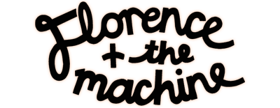
 Florence + the Machine are an indie band and I feel that their artist logo represents this. The type of font is very curly and I feel that it flows nicely on the eye. I think that it has quite a handwritten appearance which adds a bit more personality to it and is more unique than other logos out there. The composition is also rather different too. Like some, many artists logos are their name written horizontally across in a straight line whereas Florence's is in chunks of three beneath each other and it curves round to be more like an oval shape- I think this is very successful and something we may even consider for our own due to how individual it is (also Florence + the Machine's music is of a similar genre). I also noticed that the entire logo is in bold writing and that 'Florence' is not bolder than 'the machine' as she is the lead singer- this connotes that she values equality within her band and does not think of herself as higher importance, this would be different for a solo artist such as Lana Del Rey who's name is in very bold writing to show her significance. Although we would like a logo that is easily recognisable, I do not feel we should use similar font to that of Florence + the machine as it appears quite feminine and we are aiming for something more unisex as our target audience is girls and boys.

When comparing this logo to other artists we had looked at, this one was our favourite. Lana Del Rey has gone for a very slick bold font that stands out immediately when the eye first glances at it. This is successful as it means that it will capture your attention if you were searching for an album to purchase- the boldness of a logo is something we are seriously considering. The logo shows that she has a sense of importance (possibly as she is a solo artist in comparison to Florence and the Machine who are a band) and that she is serious about her music. The use of capital letters also means that the name is screaming out at the viewer, a good technique to, again, capture your attention and is something we will almost definitely consider for our own.

For an artist such as Birdy who is branded quite young and innocently, I feel that this logo is perfect. The font is delicate and dainty which is much like her slow and heartfelt songs which shows that her logo is representative of her image. The font is very individual and nothing like I have seen in other artists which shows that Birdy's interest is in being unique. I noticed that the logo is underlined, this could be because the font itself is not majorly bold or invasive, therefore by putting a line underneath it it creates more of a statement and importance. Elements that we will take from this logo is the simplicity of it as we do not want the text to take the audience's focus away from other areas of our album cover. We would also like to find a font which is representative of our artist who also sings about heartbreak, therefore there are some strong similarities.
Artist Logo
Record Label Logos:
This logo looks of a very professional quality. I feel that this may be because of the type of font used- this is as it is bold and black which adds more of a uniformed appearance and therefore stands out to a viewer which is the company's key aim. As universal music group is such a recognised company, it is vital that it has this slick look in order for it to like they take their business seriously. Universal is a multimedia company meaning that their logo needs to cater for both music and films, I believe that this is works very well as an Earth is versatile and represents diversity meaning that their music could appeal to all. I feel that this logo is very successful and I feel that we should take inspiration from this simplistic look as it is not too busy and stands out instantly.

I found this logo the most appealing out of them all. I think the reason for this was the unique shape that it is in- I have not seen any other record label logo in a circle which immediately makes it more independent and stands out from the rest. I think that the choice of colour is also effective because red is associated with a warning or danger meaning that we, as humans, are evolved to react or be drawn to this colour- meaning that an audiences eye will naturally be led to the logo which I feel is a very clever method. Not only this but the fact that the font is in white gives it that bit more contrast in order to appear more bold and grab the viewers attention quickly- this is something that we also want to aim for. The type of font is very wacky and individual, again something that gives Virgin that unique brand that no other company has. Whilst one of the words are on more of a bubbly, fun side of things, the word 'RECORDS' are in a completely different font of their own- the font is far more slick and simplistic which adds more of a professional appearance to a very serious business. This is something that we will definitely use in our own as we would like one more creative font and another more professional font.

Q Prime's record label logo is one that I found particularly interesting. One of the reasons for this is due to its lime green colour of which I haven't seen on any other logo about. I think this is particularly successful because not only is it unique, but the green is very eye catching meaning that the audience is instantly drawn to it. As well as this, I noticed that the 'Q' is in a similar shape to a record on a record player which obviously has clear link to the music industry. I believe that as a group we could use an idea similar to this as it shows the importance of record labels in the music industry. I also feel that we could underline one of the words in our record label company's name (like above) as this creates more of a statement and looks very professional.

No comments:
Post a Comment