Wednesday 21 October 2015

Choosing our 'Star' / Lip Syncing Auditions

Lip Syncing Auditions
Firstly, we came to the conclusion that we would like a group member as our artist. This is as we know that a member of our group is 100% reliable and willing to come out filming at a variety of locations over multiple days- also we all agreed that it would allow us to be brutally honest with each other. This is, therefore, why we chose to volunteer ourselves as the artist- both Millie and Evie carried out a lip-syncing audition where they both selected a song of their choice (by a female artist we had researched one way or another). After filming, we were then able to put the song track behind the video so that it was in time with their lip syncing.
This is Evie's lip syncing audition to the song 'Dog Days are Over' by Florence + the Machine. From the video, you can very clearly see that she lip synced the video very well as she was in time and didn't get a single word wrong. Despite this, I would say that the song was slightly over sang in some areas and under-sang in others which can give quite a fake appearance for an artist with a very powerful voice. This slightly unrealistic appearance meant that it was a downfall to her audition.
In terms of branding, Evie has an independent style which would be perfect for our own video- therefore, image wise, this could definitely make her a possible contender.
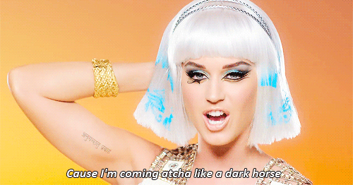
In Millie's lip-syncing audition, she sang to the song 'Love Me Harder' by Ariana Grande. A positive of this video is that she got all of the lyrics correct and was very in time, meaning it looked believable that she was singing it in real life. We did however find a flaw in it which was that her facial expressions were not very convincing in a way that made her appear like she wasn't really enjoying herself or feeling the music. Having discussed this as a group, Millie has taken this constructive criticism on board and is very willing to work on it. 
Just like Evie, her fashion is also alternative meaning that she would fit our artist's character branding very well. Not only this, but her style is also versatile meaning that she can also pull off very bohemian looks- something that we could use to our advantage when it comes to the fashion side of our music video. Millie is a very strong contender.
Our Chosen Star
To conclude, we decided to choose Millie as our chosen artist. For the most part, this is due to her strong ability and confidence to lip sync which is very important when it comes to filming in public places as we wouldn't want our artist to appear timid in our final product. We also believe that her style is very versatile therefore the costume running throughout the video would be strong. Millie's acting and dancing experience means that she will be able to pull off a more believable act and also means that she has a lot of rhythm which is essential in creating a realistic appearance. Millie has said that she is going to work on improving her  facial expressions whilst lip syncing so that she will be able to convey and variety of emotions by relying solely on her eyes and face.

Nova's Logo- Final Outcomes

After much discussion and consideration amongst our group, the logos with the highest amount of votes are below.
We settled on the text called 'Arenq' which we found on DA font as the design for our logo for our artist 'Nova'. One of the reasons behind selecting this text is because it is so versatile. There are many ways we could manipulate it such as by altering the thickness of the line in order to create more of a bold statement- this way our artist can stand out amongst the rest. We would like the logo to be as prominent as possible when placed on our album cover so that it doesn't blend in with the background image, again, which is why we need to consider the weight of line. I also think that the logo appears very professional and could easily look like it belongs on an album cover as it also has quite an edgy style which was what we were aiming for. I believe that this text will be very effective and successful in terms of representing Nova as it is dynamic, modern and simplistic.
This is our final logo for our record label that we created called 'Opal Records'. We chose to select 'Sandre' as our final font as we felt that this font was most aesthetically pleasing and professional- a look we are constantly striving for. Whilst in the process of making this decision, we all agreed that it needed a little improvement in order for it to qualify for our album cover- this was in making it look most realistic and professional. We did this by selecting a much slimmer, light weight, spread out font beneath 'OPAL' saying the word 'Records'. We all decided that this new addition makes the logo look much more formal and business-like. We believed that our original font was still the most successful as it looks most current and modern; with the lines within the letters having strong links to the music industry as they can be interpreted as guitar strings or piano keys- therefore the combination of both fonts, as a whole, looks the most successful. We want our logo to remain in a black font in order to secure its slick and business look that we are going for, which is also beneficial to us too as it means we would not have to manipulate it as much.

Tuesday 20 October 2015

Creating Nova's Logo

We researched on DA Fonts for a font that could be used for our logo for Nova. We liked the stenciled effect that this logo gave as it had quite a structured appearance- this would look very sophisticated for our album cover which would be suitable as we are aiming for a professional look. We edited this logo on Photoshop by doubling it up to have a more unique effect. I decided that I don't particularly like this look as it can make it rather difficult to read and we would like it to be very clear.
I like this logo as the lines are very precise and structured. This gives it a very geometric appearance as it is predominantly made from shapes and outlines which are not filled in- this can be a positive as it is not too bold therefore will not detract the viewer's attention away from the main focal point (which would be the photograph of the artist on the front cover). I also like that there are some parts of the line missing in the letters which gives it more of an 'unfinished' appearance- this could portray a sense of mystery within our artist, possibly intriguing the audience.
This logo (to the left) is more of a bold option for our logo. I do not believe it to be as successful as the previous one because the letters are completely filled in, meaning that it appears rather 'heavy' and maybe distracting. We did, however, consider it due to the fact that there are symbols above and below each letter which adds more creative patterns to the words, therefore making it look slightly more intricate and interesting. We rejected this logo because the style of font was not particularly what we were searching for. It didn't appear very unique compared to others as it looked like it could be found on Microsoft Word- something easily accessible to many people and therefore running the risk of looking too 'mainstream'.

This logo has quite a tattoo appearance which I am not particularly fond of. I feel like the curly decorative pieces are a little too much and can even make the title look slightly tacky (in my opinion) which is not something we are striving for. I do not think that it matches our 'unique' and more independent image as this type of font is something quite commonly seen (again, in tattoos) which is why we may reject it.


This is one of our possible logos for our record label 'Opal' that we created. The first image above shows the type of font style we selected called 'Sandre'. I really like the type of lines included within each letter- it gives off quite an edgy appearance and is not something I have seen before, also an important factor in making our logo unique and standing out from the rest. Not only this, but the lines are a range of thick and thin in size, meaning that it would appeal to everyone's tastes. I also feel that they resemble piano keys in a sense which creates a strong tie to the music industry. The text is distinctive and very easily recognisable. The only issue with it is that it could potentially be very difficult to incorporate colour into it due to how bold it is, however this may not be an issue as black writing makes it appear more professional- something important in a very serious industry.
 
This is another logo we could potentially use. This is not my favourite due to the fact that the font is extremely bold and difficult to see as it is so large and thick- this can give quite an immature appearance which is not something that would suit our desire to have a professional appearance. Saying this, having bold font could have a positive outcome as it is able to be easily communicated to an audience and will therefore act as a statement, making an impression immediately. The extra large letters are rather intimidating which could represent the fact that this record label is the best in the business. The 'O' in Opal looks very visually similar to a record which, again, means that there are strong visual links to the music industry. However the font, to me, as a whole is rather plain and not very unique- something we are trying to avoid as we are aiming to create an independent record label.
This font is also not one of my favourites of the others we have created. I do not think it would fit into the 'music business' category as it seems to have more of a horror feel to it, which may be something to steer away from. The letters themselves are also rather peculiar looking- as the weight of line varies which creates more inconsistency. Saying this, as the font is so unique, this could be a positive thing as we wouldn't want our record label to look like anything pre-existing- and the more unique it appears, the more it would stand out.

Monday 19 October 2015

Institutional Research

The purpose of record labels are to represent different artists. Some artists are signed to major labels, others independent. This can also vary depending on the type of music the artist produces. For example, a major label would be more likely to represent and artist producing music of the pop genre.
Many artists starting out are known to work their way up progressively in the music industry, starting out their career under an independent record label and then after gaining some success and popularity, end with a major record label. Domino is an excellent example of a successful independent record label with equally as successful artists signed to it from the likes of 'Arctic Monkeys' to 'Blood Orange'. 
The difference between an independent and major record label is the fact that independent record labels do not get near as much financial support. This would therefore give the artist less backing in order to progress in the industry, e.g. promotional perks such as radio play and album advertisements on television- major labels would be able to provide this however.
Smaller independent record labels have less money which could have a knock on affect on the artist signed to it, e.g less quality and quantity of music videos it is able to produce, therefore making them less likely to reach the charts. (lack of promotion)
All negatives aside, independent record labels often provide much more freedom for their artists by creating their own image/content which makes the artist more real, unique and raw. An opposite example to this is One Direction who are signed to Sony. As this is a major label, it is well known that they do not have as much individuality and do not have much of a say in their image or the music they produce. Their management is rather strict and brand them regarding to their target audience, inevitably proving that the majority of these factors fall down to finance. This proves that independent record labels are not all negative as you would rarely find an example of One Direction's on a label such as Domino.


Major record labels are known to dominate the charts, often as a result of their financial resources. Their ability to produce the best quality and popular music videos also links back to money as they can afford the highest budgets which are carefully designed to fit an audience's desires to secure record breaking views which is what they crave. Major record labels secure artists access to the best recording studios, song writers to collaborate with, personal stylists to always keep on top of their 'branding' and the most technical up to date software. 
Some of the most well known labels are The Universal Music Group, Columbia Records and Warner Music Group. Beyonce, Sam Smith and Little Mix are just a few successful stars signed to these major labels. This type of label ties in with globalisation as all of these artists are able to be promoted to a universal audience which is an example of why they appear so frequently in the charts and appear on music related television shows such as The VMAs which are watched globally by a large number of people.
In terms of our own artist 'Nova', it's crucial that we carefully consider the type of record label we want to to be represented by and how we want our own label 'Opal Records' to be presented. One of the main factors that we wanted to present in our video alone is staying true to yourself therefore it wouldn't make very much sense for us to have a label that controls their artist and could potentially restrict their unique choices (a major record label). We therefore feel that an independent record label would be an ideal choice for our artist and would also make more sense as Nova is only just starting out in the industry so an independent label could be perfect for her. This smaller label could act as her foundations as she slowly works her way upwards, the want for chart success may also introduce her to a major label which could give her more exposure as well as financial security- an independent record label can never guarantee this.

Following this research, we have decided that 'Opal Records' will be an independent record label. A reason for this is that Nova is a new act and will therefore give her the time and support to create her own image/brand in order for the public to familiarise themselves with her as a person before she proceeds to bigger things. She will be able to find herself whilst creating a strong fan base which is invaluable. 

Logo Research

Artist Logos: Florence + the Machine are an indie band and I feel that their artist logo represents this. The type of font is very curly and I feel that it flows nicely on the eye. I think that it has quite a handwritten appearance which adds a bit more personality to it and is more unique than other logos out there. The composition is also rather different too. Like some, many artists logos are their name written horizontally across in a straight line whereas Florence's is in chunks of three beneath each other and it curves round to be more like an oval shape- I think this is very successful and something we may even consider for our own due to how individual it is (also Florence + the Machine's music is of a similar genre). I also noticed that the entire logo is in bold writing and that 'Florence' is not bolder than 'the machine' as she is the lead singer- this connotes that she values equality within her band and does not think of herself as higher importance, this would be different for a solo artist such as Lana Del Rey who's name is in very bold writing to show her significance. Although we would like a logo that is easily recognisable, I do not feel we should use similar font to that of Florence + the machine as it appears quite feminine and we are aiming for something more unisex as our target audience is girls and boys.

When comparing this logo to other artists we had looked at, this one was our favourite. Lana Del Rey has gone for a very slick bold font that stands out immediately when the eye first glances at it. This is successful as it means that it will capture your attention if you were searching for an album to purchase- the boldness of a logo is something we are seriously considering. The logo shows that she has a sense of importance (possibly as she is a solo artist in comparison to Florence and the Machine who are a band) and that she is serious about her music. The use of capital letters also means that the name is screaming out at the viewer, a good technique to, again, capture your attention and is something we will almost definitely consider for our own.

For an artist such as Birdy who is branded quite young and innocently, I feel that this logo is perfect. The font is delicate and dainty which is much like her slow and heartfelt songs which shows that her logo is representative of her image. The font is very individual and nothing like I have seen in other artists which shows that Birdy's interest is in being unique. I noticed that the logo is underlined, this could be because the font itself is not majorly bold or invasive, therefore by putting a line underneath it it creates more of a statement and importance. Elements that we will take from this logo is the simplicity of it as we do not want the text to take the audience's focus away from other areas of our album cover. We would also like to find a font which is representative of our artist who also sings about heartbreak, therefore there are some strong similarities.
Artist Logo

Record Label Logos:
This logo looks of a very professional quality. I feel that this may be because of the type of font used- this is as it is bold and black which adds more of a uniformed appearance and therefore stands out to a viewer which is the company's key aim. As universal music group is such a recognised company, it is vital that it has this slick look in order for it to like they take their business seriously. Universal is a multimedia company meaning that their logo needs to cater for both music and films, I believe that this is works very well as an Earth is versatile and represents diversity meaning that their music could appeal to all.  I feel that this logo is very successful and I feel that we should take inspiration from this simplistic look as it is not too busy and stands out instantly.
 
  I found this logo the most appealing out of them all. I think the reason for this was the unique shape that it is in- I have not seen any other record label logo in a circle which immediately makes it more independent and stands out from the rest. I think that the choice of colour is also effective because red is associated with a warning or danger meaning that we, as humans, are evolved to react or be drawn to this colour- meaning that an audiences eye will naturally be led to the logo which I feel is a very clever method. Not only this but the fact that the font is in white gives it that bit more contrast in order to appear more bold and grab the viewers attention quickly- this is something that we also want to aim for. The type of font is very wacky and individual, again something that gives Virgin that unique brand that no other company has. Whilst one of the words are on more of a bubbly, fun side of things, the word 'RECORDS' are in a completely different font of their own- the font is far more slick and simplistic which adds more of a professional appearance to a very serious business. This is something that we will definitely use in our own as we would like one more creative font and another more professional font.

Q Prime's record label logo is one that I found particularly interesting. One of the reasons for this is due to its lime green colour of which I haven't seen on any other logo about. I think this is particularly successful because not only is it unique, but the green is very eye catching meaning that the audience is instantly drawn to it. As well as this, I noticed that the 'Q' is in a similar shape to a record on a record player which obviously has clear link to the music industry. I believe that as a group we could use an idea similar to this as it shows the importance of record labels in the music industry. I also feel that we could underline one of the words in our record label company's name (like above) as this creates more of a statement and looks very professional.

Lip Syncing Research


We researched lip syncing using YouTube which is a video sharing platform. The Tonight Show with Jimmy Fallon is a late-night talk show which features a lip sync battle between the host, Jimmy Fallon himself, and a guest celebrity. They both take part in two songs each- above is an example of Tom Cruise's lip sync battle. We discovered how successful lip syncing can be when focusing on a few minor factors. We were able to analyse these key characteristics in lots of detail whilst the two celebrities are trying to win the title of the best lip syncer. This therefore gave us a clear insight into what makes for successful lip syncing.

The main points we learned about lip syncing by this video was that timing is essential. Even a tiny second out can make it look very unrealistic. In the example provided above, it is clear that both Jimmy and Tom are very in time- also showing that, evidently, practice is key.

As well as this, I believe that what facial expression you have is very important. In the areas of the song which are more powerful and like the artist is shouting, the person lip syncing must look like they are singing this parts with much stronger/exaggerated facial expressions. This would therefore mean that their mood would appear to match that of the song, and look like it is actually them realistically singing.

These are all points we need to consider when our own artist is lip syncing in our video. We will be carrying out lip syncing auditions to see which person could be our potential artist and have taken into consideration the factors required to be successful such as timing and expression.

Tuesday 13 October 2015

The Purpose of Music Videos in the Digital Age

The main purpose of a music video is to promote an artist and their single. The development of the digital age has meant that music videos are becoming more and more important in order for an artist to stand out from the crowd in the competitive music industry. A reason for this is because any area surrounding music, be it audio or visual, can now be accessed on a variety of different platforms therefore artists are now putting extra emphasis on their videos to spark up attention and capture the eye of both the public and the media. Music videos are a visual representation of a song/songs. I noticed that Katy Perry, who is a very successful charting pop artist, uses extravagant themes in many of her videos. 
An example of this, above, is her music video for her song 'Dark Horse'. In this video she has mainly used costume in order to stand out from the rest- the song is heavily based upon the Egyptian era therefore there are huge and constant visual references throughout. She is dressed up in a very bold Egyptian costume, I believe that she is representing Cleopatra, which changes colour as the video progresses. Her make-up is also extremely striking adding to the multicoloured theme. I think that this video is very clever in terms of drawing public attention to it, this is important as the video needs to also appeal to people outside of her usual target audience. An example of this is the fact that males may be interested in watching this video as she brings more glamour and sex appeal to it, even though they may not necessarily usually listen to a female pop artist who's fans are predominantly female. An example of the sex appeal in this video is when she is seen pole dancing in an Egyptian setting which matches her branding because she is looked at as a sex symbol therefore it is not out of the ordinary to see this in a Katy Perry video. The consistent use of these suggestive scenes in a range of her music videos means that the public/and or an audience not typically drawn to Katy Perry's music are aware of this and will therefore continue to watch many more- this is an example of successful promotion. 
One of the main reasons why lots of attention is drawn to this music video is due to the bright colours. Many artists in the music industry are known to use rather basic and plain costumes which I feel gives a very slick and professional appearance however they all merge into one and are not very memorable. Katy Perry's use of colourful, weird and wonderful wigs mean that her image is instantly recognisable and we would be able to associate any other 'Egyptian look' with her 'Dark Horse' music video which is, more than likely, exactly her aim. 
She has decided to include a storyline within this video which helps an audience understand the meaning of the lyrics. I feel that this video is an accurate visual representation of her song where it portrays her as a strong and powerful female in a 'modern' yet ancient Egyptian land. The use of breaking gender stereotypes would also definitely draw more attention to this video as women in society can be seen as weak and she is portraying the opposite- also supporting her 'strong female' branding. I feel that this video would get people talking as it is so visually different to so many existing music videos on the market- therefore standing out straight away. The video could appeal to a lot of different age groups and cultures due to its entertainment factor, perhaps acting as a guilty pleasure to the viewers as it stands out so much that people would want to watch it regardless of whether they liked the actual music- this shows that making a music video visually exciting is all very important in terms of reeling in different audiences and making them want to continue watching.
As this video is predominantly featured on YouTube it is most likely to be viewed on this platform. Along the side of this music video has a 'Suggestions' section where a lot of her other music videos are advertised meaning that if a viewer likes this, they may like another- thus promoting the artist's music even further to help sell the single and potentially the rest of the album.0
Gender is a large focus in this music video. Her character is represented as similar to Cleopatra who ruled a country and married Caesar- an incredibly powerful figure. These rather visually clear and strong associations make Katy Perry look like a strong female. This is quite unconventional of her gender as females are normally represented as weak therefore her powerful female representation could suggest that she is a dominant artist in the music industry and not afraid to show off her achievements/talent.
From researching into the purpose of music videos, I have gained a greater knowledge of why they are so important in today's digital age.

Naming Our Record Label

The prezi attached below discusses all of the possible names we are considering to name our record label and our reasoning for choosing them. We also discuss our final decision and why we believe it to be the most successful.

Digipak Research- Front and Back Cover

Digipak Research
Kate Nash- Made of Bricks

Album art work is very important as, almost always, it is the first impression we get of the artist and their branding.
The front cover of Kate Nash's first album is a very striking image. It depicts an artificial house with a garden which creates quite a fantasy theme. The artist is seen walking on the path towards the house, with her stance appearing very feminine and girly- the fact that she is dressed in red adds to this as it is associated with love and passion which is a theme that the artist consistently revolves her ideas around. The image looks like a studio shot as there is a block coloured backdrop as the background- this makes the image look very set up yet still effective and bold as there is full control over the lighting in a studio (as opposed to natural unpredictable light outside). The artist's name is considerably larger than the album name 'Made Of Bricks'- this is as the artist's name is more important to be promoted as they are the most significant feature of their music as a whole. The fact that the artist's logo (their name) is in the colour white against the bright blue background, I feel, makes her name stand out to the audience even further and possibly making them more intrigued. The type of font itself appears very playful which I believe matches the imagery as it is similar to a child's dollhouse. The fact that a house is on the album cover could foreshadow the fact that many of Kate's songs revolve around a mundane life. I do not think we should produce our own album front cover to look like this as I think that it has a less professional look to it which is not what we're striving for. Also I think we should take our shot of the artist outside and not in the studio so that it link more with our video (which is also all filmed in the outdoors)- this will therefore show more consistency within one album. I also believe that we should have more of a closeup shot of our artist and not a long shot- a reason for this is so that our artist's face is much more clear and recognisable so that the audience can begin to get familiar with it.

The back cover of Kate's album 'Made Of Bricks', I feel, is very successful. A reason for this is because the colour in the background of the front cover fades into the background of the back cover like a gradient- this therefore means that when the viewer proceeds to look at the track listing, it is consistent with the appearance of the front album artwork. I like that there is completely no imagery on the back cover as it does not distract the audience in any way and only naturally draws the eye to the most important information. The font is of a contrasting white colour which, again, makes it appear brighter and stand out further against the dark background. The type of font looks like handwriting which gives it a very casual and ordinary feel as it is the type of writing I read everyday- this can make the album seem less intimidating as looks like someone you know has written it with no huge production. A juxtaposing idea would suggest that the handwriting font makes the album look more unique as everyone's handwriting is different- this is successful as it means that no other existing album would look the same as this which is important in order to stand out. In terms of our own digipak, I think that this style is something we would consider ourselves- I really like the simplicity of just having one plain background colour as there is no distraction and we would then be able to work on a more interesting, unique font like Nash's. Saying this, we are undecided as to whether we would like to include our artist's face on the back cover in order to show more consistency from front to back- however this may look a bit too much for the viewer which is an idea that needs to be considered.


Lana Del Rey's 'Born To Die' album cover shows a mid shot of the artist standing in a sheer white blouse in an outdoor environment. She appears to have a very tight, strong yet neat uniformed stance with a straight face and her hair tucked behind her shoulders. This gives her quite a tough appearance like she is a powerful female in the music industry which is rather rare, breaking any gender stereotypes in society and the music business. Lana has direct eye contact with the camera which, to me, is the equivalent of direct eye contact with the audience. This makes the album cover appear more personal which creates a stronger connection between the viewer and the artist. The artist's logo 'Lana Del Rey' appears very bold and is a successful contrasting colour against the sky. Saying this, the white compliments the overall image as blue and white are associated with peace and tranquility which also match the style, musically, of her songs. The font is in complete capital letters which adds further emphasis on her name- this is important as the audience is straight away aware of her identity. The album title 'Born to Die' is in the same font, to show consistency, but in a much smaller size and placed at the bottom of the frame. This could be because it is less important than the artist's name however still significant. The colour of this particular title is in the same muted shade of blue as the sky in the background, this time overlaying her white blouse to create the same contrasting effect as the main title however this time in reverse. I feel that we could use the same type of style in terms of using two main colours that match the main photograph in the background as it shows greater continuity. Lana is standing in front of a fence, tree and what looks like a form of vehicle in an outdoor location- this is effective due to the fact it appears very casual and almost like it could be her own back garden- this could therefore be more relatable to an audience as it can represent everyday life, much like the symbolism in the lyrics to her songs.
I believe it would be a good idea to consider using outdoor locations on the front cover of our own digipak as it brings more colour and life to an image rather than a plain studio backdrop without much character.
The back of the album cover has the same font as the front cover, sticking to both of the main two colours used throughout (blue and white)- this, again, shows greater consistency to a viewer and makes it appear like it belongs to the front cover, this shows that it is successful as it looks like one complete item. Lana has used a similar method to Kate Nash in the way that there isn't a background image. Instead, there is a plain white background with the font over this- this may be because the track list is then easier to read as there is a great contrast which causes it to stand out. Again, I think that this method of a plain background on the back over is something that we are swaying towards as it means that there is no distraction and the audience focuses on what is most important. Small numbers have been used next to each song title on the track list in contrast to the large font- this is significant as it shows that the song titles are most important and the viewer's eye is naturally drawn to it straight away. It is definitely not a traditional way of presenting a track list which I like and would take inspiration from for our own album cover as we are aiming for quite a contemporary feel which I believe this demonstrates. 

This is the album cover for Eliza Doolittle's 'In Your Hands'. Similarly to Lana Del Rey's debut album, it has a very simple look to it. There is plain bold font which has her name written in block capital letters- as there are only five letters it takes up a large amount of space across the front cover- they are in a striking pink colour which I feel is successful as it easily captures the audience's attention. This is something we will definitely consider for our own due to the fact that it makes the audience aware straight away about the artist's identity which is important (so that it is memorable). I like the fact that there are contrasting colours as it makes the title appear even more bold, therefore proving that it is the most significant thing on the cover. I believe that the simplicity of the album is something that will inspire our own as we either have this option or the choice to make more of an in depth album, unique cover.
I feel that the choice of font that she's used is very successful, especially as the font choice and colour could run the risk of looking slightly unprofessional- I believe that it appears very tasteful, with the bright pink colour possibly referring to her femininity, and individual as she has used her own handwriting for the album title. The fact that her own handwriting is used contributes to a more personal album, strengthening the connection between the audience and artist. 
One of the most effective things about this album cover, to me, is the fact that the image of her overlaps the title text. It makes her face stand out just as much as the album name which shows that they are both important and draws the viewer's eye to them both simultaneously. The fact that she is standing in front of the text could also show that her face has more significance as her branding and appearance can be deemed very important. I believe that we should consider using this technique as it has had quite a large impact on me as it was one of the first things that i noticed about the cover- which is also our main focal point (being the artist's face and the album title).
Eliza is wearing a low cut and rather suggestive dress, this can portray a sense of sex appeal in order to, stereotypically, draw in a male buyers which could increase the size of her target audience. As a whole, I feel that this album appears very mature and therefore professional which is something our group will definitely strive to achieve and take inspiration from. One negative about the front cover is that the 'handwritten' title font could be slightly tricky to read and is consequently not something you'd be able to read from the other side of a shop which isn't ideal, therefore I will take note that the fonts we choose need to be bold and clear.

The back cover appears to be just as successful as the front. One of the main reasons for this is because the colour scheme runs right through to the back, sticking to the black and white contrast with the bubblegum pink which means that it has a lot of consistency to it. I believe that our group should also stick to the same colours throughout as it makes the album come together as one, rather than it looking like two separate products. The font on the track list is the same 'handwritten' font as the title on the front, however it is in a white colour which is very similar to the background making it, again, quite difficult to read- this is something we want to avoid.  Eliza is positioned to the right hand side of the frame to make room for the track list along the left hand side. I think that this looks successful as there is a balanced composition in terms of significance- the artist being featured on the back shows that she has a high sense of importance whilst the list of songs next to her are usually what a viewer turns to the back cover for to look at. It is an interesting idea to have an image of the artist used on the back of the album as not many others I have looked at do this which creates a sense of individuality. I also believe that it creates more of a personal feel to the album which is something that we are really aiming for (hence planning a lot of direct eye contact and point of view shots for our video to put the audience in our artist's shoes). In the actual image of Eliza, again, it is a shot that portrays a lot of sex appeal, this time with her strap down on one arm and the outline of her underwear more visible than previously. I like that the two images used (on the front and back cover) are almost identical, just with a different stance as it shows a lot of consistency. I also think that the nature of the photo makes her album appear more mature than her other albums where she was previously known as 'Eliza Doolittle'. The image presents her hair swept over her face meaning that her body is an emphasised element of the back cover- I do not think that we will include any 'sex appeal' on our cover as it doesn't really match the branding of our artist (who is more innocent than Eliza herself).

Saturday 3 October 2015

Permission Letter to the Record Label

Copy right is a legal right given to the owner of the original piece of music or work.  These types of rights allow the owner to have full control over their music such as by deciding who can use it or reproduce it. 
An example of this would be Madonna asking for copyright permission to sample Abba's song 'Gimme! Gimme! Gimme!' on her single 'Hung Up' as it is not her original material. 

Our group had to email Lana Del Rey's record label 'Stranger Records' before we could continue with the planning of our music video to ensure that we would be able to use her song 'Without You' for our own purposes.

Below is a print screen of the email I wrote to 'Stranger Records'. I clearly stated our reasoning for using the song (for our A-Level Coursework) and the fact that we were not gaining any profit from using it as it evidently does not belong to us. I also stated how if the record label didn't respond to my email that I would presume access had been granted for us to use the song.