3. What have you learned from your audience feedback?
After previously having uploaded our music video rough cut to Facebook, we were then able to make improvements. Having posted this version on social media, it therefore got exposed to a wider audience outside of our target of ages 16-23. We were able to see which improvements should be made, equally valuing our target audience's opinions and those outside of this bracket- it was interesting to see whether they had similar taste to the target audience which we soon discovered to be true. Our target audience also included males as well as females because we felt that our chosen artist's music (Lana Del Rey) appealed to both genders. We had evidence of her appeal in males as we knew male friends who were big fans of her, she is also an attractive artist and therefore has a large amount of appeal in a male audience. Females may identify with her as her lyrics are about love/heartbreak from a woman's perspective and the fact that she is a solo female artist- therefore it is natural that females will want to watch and listen to her.

People older than 23 liked an commented, saying they thought it was 'highly enjoyable' and likewise with our target audience, this shows that it appeals to those outside of this age range too. As aforementioned, viewer's main criticism was that the ending should be changed as it is not of the same standard as the beginning of the video- we all agreed on this and it was nice to have feedback from a fresh pair of eyes. Following this feedback we were able to use some footage from an additional filming day we had organised in the studio and the footage turned out to be far more appropriate.
This is evidence that we took our audience's feedback on board:
 |
| Ending before audience feedback |
 |
| Ending after audience feedback |
We felt that making these changes was a successful decision because the indoor studio added a different dynamic to the video. This may be because it was an indoor studio and we had not yet filmed inside and because the lights added an intriguing, striking pop of colour. The fact that it is an indoor location means that our video is now more conventional like other music videos in the industry as we have used a combination of in and outdoor locations- I think it is good to adhere to some typical conventions as it makes our video more traditional in some places which is comforting to an audience, however in other areas it is slightly more unconventional meaning that there is still equilibrium.

Not only this, but our audience also brought up the fact that the red ivy clip of the camera tracking the artist as she lip synced was not as successful as it could be- this is as her hair had fallen in her face and you could no longer see what she was singing. To resolve this, we removed the clip and replaced it with one of Nova lip syncing on her bed. It was a good idea to use this clip because a similar one is seen else where which adds to the continuity- repeating certain clips in music videos is also conventional and we wanted to stick to some of these ideas for the same reasons.
After making these amendments and, as a group, we were all pleased with the finished product, it was uploaded to YouTube. YouTube is a video sharing platform which can be accessed by absolutely anyone online- it was important to us that this was the case because it meant that a wide range of different people outside of our target audience would be able to watch it.
It needed to be accessible so that as many people from within or outside our target audience could view it and give us feedback. We value everyone's comments & opinion regardless of whether they are 16-23, it is interesting to see whether our video appeals to people outside of the age bracket. Uploading it to YouTube was also very useful in order for males to be able to view the music video too. This is because we are more likely to have a female's opinion due to the fact that there are females in our media class, therefore we needed to see the point of view from a male seeing as they are also in our target audience.
We had already received four thumbs up after only posting it that day. This tells us that it has been successful enough for four people to like it and nobody out of the 21 viewers to dislike it. This was a great start for us.
The next thing I did in order to have more specific feedback was make a survey on
Survey Monkey. I wrote this survey in order to address (mainly) our target audience however it was open to all as we are also interested in people's feedback outside of our target audience.
This is our
survey
I was quite specific with the type of questions that I used. We wanted to know exactly how our audience felt about specific factors in our music video and ancillary products, whether it be feedback on our artist's tour poster or the viewer's favourite location used in the music video. I wanted to use both a variety of open and closed questions in order to receive detail as well as statistics.
Below are the questions:
The questionnaire saw a handful of people respond. The graph shows that 20% of responses were male and the other 80% female. Although there is clearly a bias, it was still important to us that a male had given us feedback as we at least had something to compare the other responses to. As well as this, survey monkey allowed me to review participants specific answers, therefore I am able to view the male's exact responses and compare them to the opposite gender.
One of the most important questions to ask was '
What is your age?'. The reason for this was so that we could see whether respondents were within our outside of our target audience. Results showed that all respondents were within the age bracket of 16-23 years old which was extremely useful to us as that is who our music video/ancillary products are aimed at, therefore meaning that we have very appropriate answers. Although it would still be useful for us to have feedback from outside this bracket, we made sure that we had directly asked for people's opinions who fell under the 'other' category.

I was also keen to ask whether they think that our video was successful on the whole. The graph shows that 100% of people thought that our music video was successful which not only shows that we successfully produced something correctly aimed at our target audience, but also that our creativity has shone through. As this was a closed question, I thought it would be a good idea to create and open ended question which allowed them to develop their response in detail.
We found the answers on this question to be very rewarding- all of the feedback is very positive!
One answer that stood out the most to me was the fact that the viewer has noticed that there is a 'home video' vibe and that it is effective. When carrying out our artist research, we noticed how Lana Del Rey often has this old fashioned, retro type of style footage running in areas across many of her music videos. We really liked this rather unique idea and thought that it could inspire some of our own as it has a really nostalgic feel about it, a perfectly fitting emotion for our story line of loss and reminiscence.
This positive feedback reinforced our initial idea of incorporating some of Del Rey's vintage inspired shots in our own video which have clearly turned out to be very successful.
 |
| Home video footage in Lana Del Rey's 'Video Games'. |
 |
| Our take on Lana Del Rey's home video footage by filming it from the 'point of view' of the artist's boyfriend. This shot has lots of direct address which makes it very personal between the artist and audience. |
The respondent also stated that their favourite clip was of the artist lip syncing in front of the screen projection. We all agreed that the projection was a very unique idea and not one we have seen in many existing music videos which is a reason why we felt that we should try it out. Our amount of experimentation, in not just this clip but throughout our entire video, is very much evident. Our use of trial and error lead us to these outcomes (such as projection) and evidently went down very well as our target audience have specifically said that it is their favourite element of the video.
 |
| This is the screen projection that a respondent said was effective. |
In Question 5, I asked for any improvements that they would make in the video. I made sure I designed the question to be open so that they could put as much intricate detail into it as they liked, a closed multiple choice question may not have covered their answer.


An answer that stood out to me was someone stating that they felt that the artist was seen on her bed a lot. Instead they suggested alternative ideas such as further flashbacks about what she is thinking about. We had never actually thought about this idea which highlights why audience feedback is so refreshing and I think that what is suggest is a good idea. Despite this, we had previously gotten a comment from our teacher once before stating that he thought the bed scene may be a little too long and we immediately challenged this. As a group we all really liked this scene, it may be slightly unconventional in the fact that it goes on for a longer period however we feel like it flows and we wanted to challenge some stereotypical conventions in the current industry. We felt like this scene stood out amongst others and that is not always a bad thing. Also our teacher was out of our target audience so his opinion may not have 100% applied to the type of video we were aiming for although the constructive criticism was still valued.


Another piece of constructive criticism that we received was that they felt that they should see further different shots of the camera tracking the artist as they are walking directly towards the camera. This is as they felt it was very successful and that it should be featured more than once to show continuity. We agree with this statement as we personally really like this shot too and think that adding more would definitely enhance the video. Despite this, I do not think it lacks any continuity currently as we have repeated the same tracking clip more than once in another area- although filming a different tracking shot would definitely compliment the existing one.
We also asked which location was their favourite. These question answers were actually very beneficial to us because each one states a different place- this shows that a whole variety of different areas of our video are liked/appreciated.

Someone had stated that their favourite was the windy beach in Margate. During our filming day, we had noticed that the weather there was not exactly on our side- making it challenging to film in such conditions. It is good to hear that something that was at first a disadvantage to us had become someone's favourite part of the video. The fact that they also said it is relatable is good because this is something we were all hoping for, we used a lot of point of view shots to make the audience feel as if they were directly involved and this has evidently worked.
Some more feedback that we received showed that the gallery was their favourite location and not like anything they had seen before. This is good because our aim was to be unique in comparison to existing music videos- videos that use the same ideas as others tend to blend in to one another and that is certainly not what we want.
The male on the questionnaire had said that his favourite location was in the studio. This is very beneficial as it shows that the audience are now praising the end of the video after we had made changes to the ending based on our previous criticism. It shows that we have taken previous advice well on board and received a good outcome. Also the fact that he is a male and likes the scene is evidence that it appeals to both genders within our target audience.
We asked whether the audience feel the music video is appropriate for our target audience. 100% said yes which reinforces the fact that we have catered well to the age group of 16-23 that we aimed for during the planning process of the video.
Also the fact that 100% of the people answering yes are in our target audience themselves creates more validity as out of anyone they would be the ones to know whether it is appropriate.
 |
| Our Final Digipak (Above) |
Moving onto feedback about the ancillary products, we asked for feedback based on the digipak.
Someone had said that they liked the colours which is something that we as a group also really liked as it brightened up the black and white picture however was still quite subtle. Some constructive criticism that we received said that we should maybe fade the border of the black and white picture so that it blends in a bit more with the entire album. Although I can see where they are coming from, we decided to keep the photograph like this to emphasise the fact that Nova is creating a bold statement and she needed to in order to stand out in this competitive music industry. This is the reason why the picture remains like this.
Someone else had stated the fact that the cover looked 'professional' which is exactly what we were aiming for. They also understood our aims by saying that the geometric shapes supported the album title 'Fragments' which shows that our idea is successful.
When asking about our tour poster we got extremely positive feedback which is great to hear as we were all very pleased with it once it was completed.
Each and every single comment mentioned that it looked professional which is what we always strive for during the making process. It is great to see that other viewers from our target audience thought this about the product too. One of the comments in particular left us some constructive criticism, saying that we could have incorporated some colour into the text to make it stand out further. Although I can see how this would be a good idea, I like the fact that we only chose around two colours to go on the poster (blue and white) as it creates a professional appearance. I think that adding in even more colour could possibly lose the maturity which is why we have kept it as it is although I can definitely see how adding colour could brighten it up a little.
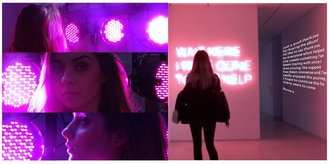
We asked whether the audience think that the insert for the album is effective. Everyone agreed and gave us positive feedback. Someone also left some constructive criticism for us:
They had said that they would 'maybe change the style of font'. I can see where they are coming from as this font is different to any of the other font we have used before. However, we felt that as it was just a quick personal message from the artist herself that the font could be justified by it being a casual more everyday font type- this also makes it more relatable between the audience and artist.
As well as using survey monkey as a means of feedback, we also directly asked people on Facebook.

I sent a link to our final video to one of my friends on Facebook (who fits in with our target audience) to directly see what she thought about it. She sent me a message back stating what areas she liked about both the digipak and music video. One of the comments she made was that the artist was styled really well. We agree with this as Nova was dressed in a way to fit the genre of the music (as the viewer had also noticed). The clothes that the artist wore matched her 'brand' and made her look really stylish which not only made her look great but her fashion also appeal to our target audience as she is of a similar age- making her more likable.
We had also, in person, asked people outside of our target audience what they thought about our music video. Comments we received included ''the artist looks great and the lip syncing has perfect timing''. This proves that our video appeals to people older than our target audience of 16-23 which is a good thing.
Overall, we feel that it was a really good idea to post our video online to see what our target audience and beyond thought about it. It really helped us to see whether both our video and ancillary products were successful and to see whether they appealed to our target audience.

 As well as this, last year we were limited to poorer technology. As you can see in the image (right), we only had access to smaller cameras however studying at A2, we were able to film with larger high definition camera equipment. This made a very evident difference in our final products- the newer cameras made our music video look of a much higher quality and thus, more professional. Not only this, but we also had access to studio lights and projecting equipment at A2 level. This meant that we were able to be more experimental whilst it also making our filming footage look much sharper/brighter and therefore creating an effective final piece. Last year we did not have access to this equipment and you can definitely see a clear difference between the two quality wise.