Wednesday 20 January 2016
Tuesday 19 January 2016
Editing 2: Changing the Ending
Once we had received our audience feedback, which mainly had constructive criticism on the fact that we should possibly make changes to the editing so that it is of the same standard as the rest of our video, we decided to make action by seriously taking these thoughts from our audience into consideration. We re-filmed a scene that we could use for the ending instead outside at school and we returned to our computer to start reviewing the footage.
At first we were quite keen on what we filmed but it didn't take us long to change our minds. I think it was because the footage was much better than the ending of our rough cut as that previous footage was much worse, but this wasn't exactly a whole lot better. We filmed Nova lip syncing the end of the song in front of green leaves with white flowers so initially it seemed a good idea as it linked in well with the nature theme that seemed to run throughout. The lip syncing on Nova's part was very well executed however we still felt the clip looked quite rushed and as if we had to chuck it at the end of our video simply for the sake of finishing it- this is not what we were aiming for, we wanted it to look consistently at the same standard from start to finish. We started to reevaluate our editing and placed an overlay of the sunset featuring elsewhere onto the existing clip which gave a stronger link to our video as a whole but there is still something not right. As we are so meticulous, we organised another filming day in the studio to hopefully get the best quality shot possible.
Monday 18 January 2016
Rough Cut & Reviews
In order to receive audience feedback, we uploaded the rough cut of our video to YouTube and then to Facebook. This let us share our video with our target audience of ages 16-23, however we also valued the opinions of those older or younger than that as it is always good to see whether the opinions vary or are similar.

We posted the video during the final stages of the editing process, this is as we were sure there was still definitely room for improvement. Asking other people for their feedback was extremely useful to us because each and every person watched the video with a fresh pair of eyes and proposed us some constructive criticism as well as aspects that they really liked about it. Using Facebook as our chosen platform to post our rough cut was a really great idea as it enabled us to contact our target audience within minutes, they were all very keen to watch and comment on it which was helpful to us.
We posted the video during the final stages of the editing process, this is as we were sure there was still definitely room for improvement. Asking other people for their feedback was extremely useful to us because each and every person watched the video with a fresh pair of eyes and proposed us some constructive criticism as well as aspects that they really liked about it. Using Facebook as our chosen platform to post our rough cut was a really great idea as it enabled us to contact our target audience within minutes, they were all very keen to watch and comment on it which was helpful to us.
As you can see, the video is definitely not perfect however this was still essential to see if the target audience picked up on these faults or even liked them. We were happy to receive a good number of likes and comments which showed that people enjoyed the video, with some commenting on the fact that it was ''highly effective, well done!!'. We noticed a large amount of people comment on the fact that the ending clip was ''quite simple'' and ''unmoving''. It was good that this was brought up because as a group we were too extremely concerned that our video ended on an anti-climax and that the quality running throughout was inconsistent. This meant that our target audience, who it is aimed at, could see this too which meant that we had to take action and arrange another filming day to alter these scenes.
It is the last scene that people remember the most, therefore we need to make it bold and of a good quality to ensure the audience is satisfied when it ends. We are considering filming outside with the artist standing in front of flowery greenery because it will match the nature theme in our video- thus ensuring continuity.
Another comment we received which required improvement was the scene of the camera tracking Nova as she walks past the wall of red ivy. She initially begins the clip by lip-syncing however as she walks, her hair falls into her face which blocks her mouth therefore you can no longer see what she is singing. It makes the clip actually look as if a mistake has been made and the artist has tried to cover which although she did well, it just doesn't look as professional as it could.
To improve this, our audience suggested we fill this space with other clips which we will certainly take into consideration as we aim to please our audience, especially our target audience as that is, inevitably, who our video is aimed at.
Other than these comments, we received a whole lot of positivity with some stating that it was ''of a professional standard'' and ''very enjoyable to watch''.
Saturday 16 January 2016
Editing
After gathering all of our footage, we began to edit our music video. At first we looked into using Final Cut Express, a challenging editing software. After much time studying YouTube tutorials on how to use it, we realised that it would be far more appropriate for us to us iMovie as we were all already very familiar with this software and would inevitably lead to a much more successful final product.


 Another editing technique we used was slow motion. The reason for this was because slowing down a video clip can emphasise what is happening and show that something is of high importance. This is key in our video as we wanted to highlight scenes which reflected Nova's time spent with her lover. Also slow motion linked well with our song as it matched the slow pace of it, making it easy to watch. I also think that using slow motion resembles a special memory. This is as when I think back to certain moments in time, it is like I am watching it in slow motion- details of the memory become clearer. This could be the same in the case that Nova is reflecting on the high points of her past relationship, focusing on the positive moments that seemed to have stopped time and never left her. We also speeded up certain clips, especially in the fast pace 'flashback' section. We were able to alter exactly how fast we wanted the clips to go so that they would fit with the beat of the song- it looked successful as our idea was for it to look like a flashback as when our artist thinks back on this section of her life it is like a whirlwind of memories and emotions which i feel it successfully represents.
We made sure that we used these techniques in different places throughout the video to ensure that we could demonstrate consistency.

After roughly selecting which video clips we possibly wanted to use we dragged them into the timeline. This meant that we had to carry out a range of simple edits including cutting and splitting the clips- this also made the timeline much more clean and concise.
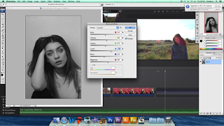
This video clip gives you a general idea of the layout of the editing software that we used. As you can tell, it is very structured and therefore simple to understand. Hovering over the clips and dragging them either left or right cut them by either making them shorter or longer. We had to adjust the length of the clips regularly to ensure that the lip syncing was in time throughout in order for it to look of a professional standard.

We decided to select a colour theme for our music video. We all agreed on having more of a blue and pink tint throughout- to do this we had to carry out some colour correction, altering the saturation of many of our clips to have the desired look.
We chose the colour blue as it is very calming which is how we want our audience to feel when they watch it. Blue also has strong links with nature which is an evidently emphasised theme featuring throughout our entire video which is why it's so fitting. The colour blue can also be associated with melancholy mood which also has strong links with the lyrics of heartbreak in our chosen song. Not only does our other chosen colour (pink) look very aesthetically pleasing, but it also has very conventional links to love/heartbreak which is exactly what our song is about. Also, pink and blue are very opposing colours- being warm and cold, therefore it will keep a steady colour balance throughout.
We decided to include still images that I had taken of Nova whilst we were on location in Whitstable. We decided to place these in time to the beat of the song during a pause between the verse and chorus. Carrying out this task was quite challenging as they had to be cut at the perfect length in order for them to look in sync with the song- I feel that we did a good job at this as after reviewing the edited footage, it flows well and adds some different dynamics to the video.


Initially, we used the clips (above and left) in their original form. When showing our media teacher a preview of our video she pointed out straight away that we need to remove any unneeded or distracting negative space. For example the sun set establishing shot included nice imagery however there was too much of the ground/surrounded area in it which took away the natural beauty. To overcome this, we simply had to use the 'crop to fill' tool in order for it to zoom into what we actually wanted (the sky alone). We feel that it makes the video appear more refined and professional, an essential element we always strive to achieve.

We made sure that we used these techniques in different places throughout the video to ensure that we could demonstrate consistency.
 |
| When selecting the clips to speed up we were able to alter the percentage levels in order to be in control of the extent of the speed in which they traveled. |
Another type of editing that we used was using fast paced cuts. Although our choice of song was quite slow, we wanted to make more of a statement in our video by merging a range of different footage and applying quick cuts to them in the hope of bringing a new dynamic to it. Our aim was for it to appear like a flashback (as mentioned above) and as if the collection of clips represented the different places our artist traveled with her other half and as if these moments in her life were flashing before her eyes. At first, we included a lot more clips (around fifteen) and had them appear on the screen for around 0.8 seconds each. Although this looked really effective in the fact that there were a wider range of different locations used to show a longer period of time, once showing this to our teacher she felt that it didn't fit in with the flow of the song. After some discussion, we all agreed that we should change it to fit in with the beat of the song and syllables in the lyrics: 'Hel-lo Hel-lo, C-Can You Hear Me? Leaving us with around half of the original clips however ending up with the cuts fitting in with the music much more effectively. We showed these new fast pace cuts to other members in our class who said it looked really effective and knew it resembled a flashback without us telling them so therefore meant that not only our original ideas showed through but it also appealed to our target audience.
Thursday 14 January 2016
Completed Tour Poster
This is our final tour poster . One of the most successful features of it is the fact that our main photograph of Nova is all in complete colour whilst the font is in white. We thought that this made more of a change to our digipak however still linked in comparison to our album front cover. This is because our front cover's photograph was edited to be black and white with colour in the background therefore we used this idea and completely reversed it by having the photo in colour and font in black and white. I think that the white font works really well as the backdrop is quite dark, therefore creating more of a contrast and giving the writing more of a pop to stand out to a large audience of people.
We used the artist's logo 'NOVA' and placed this right at the top of the poster. It was important that we used the logo as this was used on the rest of the auxiliary products. It is now part of her branding and the audience will associate the logo with the artist, so in order to familiarise the viewer with Nova, we have placed the logo on all promotional products, reinforcing our consistency.
When arranging the composition of our tour poster, we had to think of where to position the text, artist logo and imagery. It was important that we got this right because the layout can effect how professional it appears which has always been something we aim for. After a lot of discussion, we felt that the most logical way to approach this was for us to use the original picture and clone the background on Photoshop so that the width of the photograph was longer. This was so that we had more background space to place the text alongside Nova and we wouldn't have to overlap anything at all, which creates more a slick and crisp look for a professional product. I think that doing this was successful because the artist is able to be seen on one side of the poster and text on the other, meaning that the viewer is occupied with both visual imagery and written text.
We edited the photograph of the artist similarly to how the album front cover was edited by airbrushing it etc. to get a flawless look.
We chose to advertise her album 'Fragments' as well as the concerts as we felt that it would be particularly suiting for the audience to see the release of her upcoming album and then the opportunity to see the songs performed live at the same time. We used existing tour posters for inspiration on which venues to choose as it would give an even distribution of events around the country and we were also able to see what the name of these venues were called- adding to how professional it would appear. We specifically wanted Nova to visit Cambridge, her home town, and have it be her final place to perform which logically makes sense as the last song on the tracklist of Fragments is 'Home'. Following this decision, we researched into music venues in Cambridge and finally came across 'Cambridge Junction' which seemed like the perfect venue.
We personally selected the tour dates. May seemed like an appropriate month as it is in the season of Spring, renowned for new life which can symbolise the start of Nova's career.
We ensured that we added Nova's social media links to the poster with the online platform's logos either side in order for the audience to instantly know what to look for. Having this information is vital in the current digital age, especially in the music industry, because the majority of people now spend their time online and use Twitter or Facebook to keep up to date with information on their favourite artists, especially when it comes to tours as they will be the first to find out.
We kept all of the text in the same font (apart from the logo) called 'basic title font' which is stylish, fits nicely with the logos font in the way that it looks like more of a simple version of it, and is extremely easy to read. The fact that it is so easy to read is so important as it is a promotional product, often featured on posters in busy places where people read them from far away, meaning that the simplicity of a font could cost the artist essential sales.
Lastly, we added the phrase at the bottom of the poster saying that it was now available on iTunes. This is also an important feature because people stumbling upon the poster of the upcoming artist may be interested and can then preview the album on iTunes before purchasing- the whole idea is the spark interest in the audience.
Overall, I feel that our tour poster turned out to be very successful. I think we used the right amount of imagery, being just a medium sized picture of the artist- nothing too overpowering. The colours on the actual poster have been kept moderate but still very aesthetically pleasing and mature which fits Nova's branding perfectly. I also believe the font style and colour to appear very successful as it is clear to read and still looks stylish which are two crucial factors when it comes to promotional products.
 |
| Our final tour poster |
Wednesday 13 January 2016
Filming Day- The Studio
 We had decided to plan another filming day after we decided that we were not best keen on the ending of our music video. We felt that using the school facilities was a really good idea as they were so accessible to us and we would be able to use them whenever we liked- adding to the convenience even further. Using the studio and its lights meant that we would be able to get some really nice artistic shots, with the striking colour adding to the bold theme running throughout our video. We chose pink lights to be our main colour- we felt that this would best represent love which is what our whole video is symbolically surrounded by. Another reason for choosing the colour pink is because we had selected blue and pink to be our overall theme running throughout the video which means there would be added consistency.
 As we needed footage for the end of the video the most, we made sure that we filmed this more than once just in case we were not happy with the first shot filmed during the editing process. Executing the ending perfectly was most important to us as our previous ending was not successful at all and this would leave a lasting impression on the viewer- we did not want there to be any sort of anti-climax as it would completely diminish people's positive opinion of the video in the long run. We also ensured that Nova lip synced the entire song so that we could use other areas of lip syncing else where in order for that same location to be featured in the video more than once, again to ensure there was continuity.
After filming the lip syncing, I thought it would be a good idea to film candid shots of the artist when she was standing in front of the lights. I felt that this turned out to be very successful as I managed to capture footage of her laughing, flipping her hair and acting naturally in front of the camera- inserting a couple of these in our video would put the viewer at ease whilst viewing the video as Nova as acting so comfortable in front of the camera.
The type of shots I filmed mainly consisted of wide angles and mid-close-ups as we felt this best captured the type of location we were in. Any other type of shot would drive the viewer's attention away from the main focal point, being the lights and the artist. We didn't want to include too much of the surrounding environment in the shot as it would take away how professional it could look, making it a long shot would feature too much of the classroom (like the door and wires etc.) and that is definitely not what we were aiming for.
Costume:
 For Nova's costume she wore a light pink halter neck which added to her more feminine side as well as complimenting the pink lights surrounding her which also matched our pink theme that runs throughout our entire video. With this she wore black jeans and boots to show off her more edgy side- the combination of both of these make her out to be a very mature artist which is exactly what we branded her as.
Reviewing Footage:
This is the end shot i filmed of Millie lip syncing. It is an example of what will most probably replace the final clip on our rough cut. I think that this medium wide shot is successful as it allows for the brights lights to be seem all around the artist which are the two main focal points of the video. The lights create a silhouette and glow around the artist showing that she is the star of the show. As the song ends and Nova finishes lip syncing, I track the artist whilst she is still static. I think that this camera movement was also successful as it created a lens flare which produces quite a magical sense and is a more creative way to end the video rather than a standard shots where the camera is still static.

Tuesday 12 January 2016
Digipak spine

Because of this, we had to continue the same design onto the spine so that it looked like it belongs there with the rest of the album. We wanted the same geometric shapes in the same colour in order for it to flow which I think looks effective as it is only a subtle design but adds something quite unique in comparison to just leaving it plain white. We pasted the text onto the strips (the artist's logo and the album title) so that it stands out and is easily recognised. It was important that we placed her logo onto this as it is now part of her branding and people associate this font with her image, something very important in terms of an audience familiarising themselves with the artist which can also boost sales/popularity. We wanted to have the Opal Records logo in a different orientation to the other two pieces of text because we wanted to emphasise the fact that Nova is signed to this label and they are in charge of promoting the star.
Digipak Inserts
Digipak insert possible images:

We took a variety of photographs whilst on location filming for our music video as we thought it would be the perfect opportunity to take some creative shots.


When discussing which images were our favourites, we all agreed that the one of Nova facing the camera was a strong contender however my favourite was the image of her side profile. Having taken everyone's opinions into consideration, Millie came up with the solution to equally crop each image and combine them as one (as pictured left). I believe this to have turned out really successfully, with the quality looking similar to a professional standard. The pictures also go together so well as they are all of different perspectives of the artist which means that each one looks unique and not too similar. We used a photograph from our filming day in the Turner Gallery, Margate on the other page of our insert. We all agreed that this would be very suiting due to the similarities in warm colours which turned out to be true as I believe they look like they belong next to each other. On the wall, we placed the writing which we planned to be an artist 'thank you' page. On Photoshop we used the curve tool to arc the writing in order for it to look as if it is written on the actual wall which I think looks really unique and is different and more inventive than just writing it normally. We went for a very basic font in white as we just wanted simplistic seeing as the rest of our images are very powerful.
 |
| Our final digipak insert (above). |

Fragments Tracklist

As a group, we all sat down and planned the album's track list. We needed a variety of song titles which would correctly represent what the album is all about and the artist herself.
Our aim was for the album Fragments to be an empowering one. We felt that we could turn her lead single 'Without You' which is extremely heartfelt into a positive thing. This is why we ordered the song names in this particular list as it transitions from negativity to positivity. The first few songs are particularly about heart brake and the last few songs are about self empowerment and self love.
1) The first song is 'Without You' obviously by our chosen artist Lana Del Rey. I feel that this is when Nova is at the initial realisation of the separation from her partner and has to deal with these consequences- she feels empty and slightly alone, she knows it will be a tough journey back to recovery. She is at her most vulnerable at this stage.
2) The next song is '1811'. One reason for choosing this is that it is numbers and this adds something different to the track list which I think is successful due to the fact that we don't want everything to look to similar or dull. We also thought that the numbers '1811' could represent the amount of times she thinks about her ex-love everyday, the time she split up with him or to simply represent her mind being so tangled up in the moment that she cannot focus.
3) The song 'Infatuation' symbolises that fact that she had a very intense love for her partner and it has now suddenly ended, likely to never return.
4) The song 'No Light' is probably the final part of her heart brake on the album. It represents her inability to see any good in herself or the world around her anymore. She has lost all hope and will take her a miracle to get over what has happened. It represents Nova at her lowest point as she is really hurting about the fact she has lost the man she really loves.
5) 'We Are Human' - this is the moment things seem to make sense to Nova. She was at her lowest point and quickly realised that it is impossible for her to feel any worse- things can only go up from here. This song represents the fact that she realised she is only a normal human being and it is completely natural for her to feel down in a situation like this, however it is also natural for hurting people to heal. The song shows that it is part of our nature to feel emotion.
6) 'Spectrum' is a rather vague title which can also be a positive thing as it leaves the audience the opportunity to have their own individual interpretation on what it could be about. A spectrum is a wide range of colours which is a metaphor for Nova's emotions. She is letting them all out to become a happier person again.
7) 'Recovery' is the breakthrough song of the album. At this stage her heart is healing and she is learning to become herself again.
8) 'For Me' is a very raw and personal song title. There is emphasis on the word 'me' which shows that she is now beginning to focus on herself and realise how important it is to love yourself. It also can show that she made this album for herself, documenting her romantic life and the lessons she learnt along the way which will all help her in the future.
9) 'Afire Love' shows Nova's intense passion for her music, career, life and friends. It is about how appreciative she is about the life she leads.
10) 'Home' is deliberately placed last on the tracklist. Reason being that Nova has finally realised that home is certainly where the heart is and she is now back surrounded by comfort and happiness which not only ended her troublesome relationship but also the songs on the album. Her personal journey ended here. It is probably the most sentimental song on the album.
We decided to list our tracks vertically in a straight and equal list which is different to how Lana Del Rey presented hers (As seen below). We decided to have a more methodological approach with our song layout to create more structure as this is what Nova's romantic story has. There is the beginning of total and utter loss, a middle of beginning to love herself and an ending of contentment. The chronology of our tracklist is a visual representation of this. I think this works well as it immediately strikes you as bold and simple to read which creates ease for the audience as well as enjoyment.

The use of black font was a deliberate decision because it matched the rest of our digipak (which has a black and white theme in places)- this meant that there is strong continuity which is important for the digipak to look like one whole produce rather than separate little sections. Black is also a very professional colour which is definitely a look we are striving for and I feel that it was a good decision as the back cover looks slick and mature, also representing the branding of our artist.
We also kept the font style the same, again, down to consistency which is definitely key in this situation.
Creation of Digipak Back Cover
After completing our Digipak front cover we then swiftly moved onto the creation of the back cover.

We firstly began by opening up a blank Photoshop document which was of the same size as our album cover and used the droplet tool to replicate the same colour of grey from our front cover to place onto the back using the paint bucket tool in order to cover the entire surface area. Using the same colour, I feel, is highly important to ensure continuity runs throughout the digipak as a whole. Next we used dafont.com to select our font and type in the song names to preview what it would appear like before actually placing it on our back cover. After all agreeing that we were happy with our finds, the titles were pasted into the same document and made bolder (again with the paint bucket tool) to guarantee that they were 100% visible to our audience. We decided to have our font as black as this was the same colour as our front cover which created consistency. We also felt that black was very sharp and professional which is exactly what we were aiming for as we want our up and coming artist to be taken seriously.
We wanted to use the same idea of having geometric shapes scattered over the back of the cover and eventually breaking off into 'fragments', hence the name of the album (running with the theme for consistency). To do this, we copied and pasted the shape into the document, rubbing out any excess lines if we did not want a hexagon (only a triangle). The gradient tool allowed us to fade in the colour so that it could seamlessly blend into the next- this created quite a rainbow-like appearance but we made sure to keep the colours rather muted (the same as the front) as the shapes are only there as a 'decoration' so to speak and to compliment the track list which I feel this successfully does.
This time, the shapes go down and bend around the track list, continuing towards the bottom right hand corner which is a different composition in comparison to the front cover. We made some of the shapes break off near the top and then overlayed the text to change things up a little more visually. I think this technique is really successful as it differs the dynamics of the digipak- adding something a bit more creative and less uniformed.
Lastly we just had to add the legal information which included the copyright details and the artist's logo which appears on each of her auxiliary products as it represents her brand. The font remained in black to highlight the professionalism of the album design and artist herself. It also matched the track list and does therefore not look out of place at all. The barcode we included made it look as realistic as possible.
 |
| Our final back cover |
Creation of Album Front Cover

1)Firstly, the colour mode was changed to CMYK and then the yellow channel was copied and pasted whilst also inverting the layer. Next, the mode was then changed to RGB and the layer was changed to soft light.
2) The background layer was copied and then used the spot healing tool to cover any blemishes or 'imperfections'. Following this, all layers were converted to smart object.
3) This layer was copied and 'gaussian blur' was selected, the scale was moved until the skin was no longer visible but the eyes were still able to be seen.
4) Again, the original layer was copied, altering the scales this time so that skin details were clearer. It was then changed to linear light.
5) All of the layers were grouped and then a layer mask was inserted, using the paint brush tool to apply the airbrush effect.
6) Remaining layers merged, using the dodge and burn tool to contour- adding more definition to Nova's face.
7) After the skin was completely airbrushed, details were added to the rest of the features on her face to make the overall look look complete. This included filling in her eyebrows to cancel out any sparse areas, using the hue & saturation tool in order to brighten up her eyes and her lips.
8) We used the clone tool to erase the stray piece of hair that was slightly sticking out of Nova's head. We did this as our teacher commented that it looked oddly placed/stood out. We took this constructive criticism on board, especially as it was coming from an outside viewer therefore their opinion was valued more than anything because this was something not even we had noticed. We then made the image black and white, adjusting the levels to make it stand out in the right places, grabbing the audience's attention even further.
The editing was successful because it meant that Nova had a 'perfect' looking appearance which fit great for the front of a CD. It meant that the photo looks like even more of a professional quality which is exactly what we were aiming for in order for it to be taken seriously by the audience.
The image above shows the photograph being made black and white. Our reasoning behind this was because we were planning to have a colourful background and therefore didn't want the main picture on the front cover to clash at all- this meant that converting the image to black and white would avoid all of these issues however still have a strong contrast and stand out.

The layer has been duplicated as we wanted to put it onto a grey background. We did this by cropping the original image to a square and then duplicating the layer onto a new photoshop document. Light grey was our chosen colour as we had initially trialed a white background however we deemed it unsuccessful because of how unnaturally bright it appeared. We had to make the background slightly darker in order for the photograph to look like it actually belonged. It was a good idea as the colours in the background will still be able to pop whilst complimenting the black and white photograph.

Next, we inserted the font on the album cover. We all discussed how large these titles should be and whereabouts they should be placed, eventually agreeing that they were best suited at the top centre, with Nova being larger than the album name 'Fragments'. The reasoning behind this is due to the fact that it seemed more important for the artist's name to be advertised than the album, so that at a later date an audience member will be more likely to remember Nova which seemed more important- I think this was a good decision. Our reasoning for our chosen title is explained in this post. We used a font called 'Basic Title Font' for the title 'Fragments' as it was minimalistic (as we planned a busy background so didn't want it to appear to packed) and looked like a similar version of the artist's logo- therefore creating continuity and making the album look complete as a whole. (We selected these fonts from dafont.com). We used black font, again, as it matched the rest of our digipak and had a professional appearance about it which is what we strive for.


This is our final outcome for the front cover of our album. We are all very pleased with the outcome as it looks of a professional standard whilst also showing continuity across the rest of our auxiliary products/music video. This means that all of our projects look as one which is extremely important because that audience is able to link the album, say, to the video, meaning that we have successfully remained consistent.
If we were to carry out this task again, one of the things we could do differently is make the tessellation more vibrant in order for it to stand out further and possibly catch the audience's attention more quickly. Saying this, we are happy with how bright the colours already currently are as our aim was always to make them more muted to keep the more mature, laid back appearance.
Monday 11 January 2016
Insert Research
The prezi below shows our research into album inserts and the different types of information/images that can be included inside of them.
After researching, as a group we have decided to do a double page spread for our insert. On one side will be a 'selfie' of Nova which will be a more personal image that fans have never seen before- this creates a sense of excitement. The fact that she had taken the photograph herself gives it a more personal element, increasing the intimacy between her and her fans. The next page will be a thank you page, expressing her gratitude to her friends, label, family and fans- we are thinking of using a picture from on of our filming days (that has been featured in our actual music video) to create a stronger link between the video and ancillary products. I feel that this digipak insert will convey more of Nova's personality which I know is exactly what the fans want to see.
After researching, as a group we have decided to do a double page spread for our insert. On one side will be a 'selfie' of Nova which will be a more personal image that fans have never seen before- this creates a sense of excitement. The fact that she had taken the photograph herself gives it a more personal element, increasing the intimacy between her and her fans. The next page will be a thank you page, expressing her gratitude to her friends, label, family and fans- we are thinking of using a picture from on of our filming days (that has been featured in our actual music video) to create a stronger link between the video and ancillary products. I feel that this digipak insert will convey more of Nova's personality which I know is exactly what the fans want to see.
Wednesday 6 January 2016
Filming Day 2- Whitstable
23/08/2015- Whitstable


Examples of POV shots that we filmed were closeup shots of the artist holding hands with her partner. This adds more intimacy to the video and can also get the audience more familiar with her.


This is a clip of some lip syncing footage we filmed. We decided to position the artist to the far right of the wide angled shot. A reason for this is because we wanted the background of the shot to be just as important as the artist as I feel we put in a lot of effort to the locations we attended. As well as this, the camera is eye level with the artist. At times there is direct eye contact and at others she is looking away- this makes her look very enigmatic and therefore intriguing to the audience.
This video clip shows a high angle camera shot of Millie singing to the camera. We felt it would be an appropriate angle because she is singing 'Am I glamorous tell me, am I glamorous?'- therefore it is as if she is asking the audience. The way she appears to 'hold' the camera also makes it more personal between the audience and artist. Saying all of this, we decided to reject this footage as the lighting is not as we wished- also Millie's expression does not look as realistic, meaning that both of these factors affect how professional our overall video appears.
This shot I would say is the most successful from our filming day. We decided to film point of view shots because it matched the home video style that we had planned to feature throughout. I feel the shot is particularly good because it adds something more personal between the audience and artist- thus increasing the intimacy and strong bond.
Selecting Tour Poster Image
Tour poster photoshoot
After planning the type of photographs we would need in order to create our artist's tour poster, we decided to take it to the studio immediately.
Firstly, we considered which sort of outfit Nova would be wearing when shooting the poster. We wanted a statement piece, one with a rich, bright colour which could catch the viewers attention immediately. We felt that this dress was perfect for it, the geometric print fitted in with our digipak theme of having multiple shapes to create 'fragments'. We specifically chose to use an indoor studio as we would have a white screen to shoot in front of, this would not only look professional but come in handy when needing blank space beside her to place text. The studio also had professional lighting, meaning that Nova would look radiant and produce a crisp image.

 Selecting the images

Our first choice of image that we narrowed down from the variety of photographs we had taken was this simplistic image of Nova standing facing the camera. Although she looks great, I believe that her particular stance in this photograph looks slightly forced when we are going for a more natural and effortless appearance. Despite this, I do like the way she is peering into the camera lens- I think it creates quite a mysterious character in our artist which could intrigue an audience.
We thought about what type of hairstyles Nova should have, in this shot we tried her hair placed behind her shoulders- I think this creates a very statement look which we liked whilst still appearing casual and friendly. This is definitely something we want to bring forward when taking more pictures.
 This was one of our personal favourites. I like that her pose is very natural which appears very warming towards a potential audience. She has one side of hair in front and one side behind her shoulders which changes things up, visually, a little. Her body is slightly at an angle, meaning that she is looking on from an angle too. I like this because, again, it creates a sense of mystery which is an intriguing element. This photograph is definitely a strong contender for these reasons.

We decided to have our artist pose from a different angle this time so that we are able to see her side profile. Experimenting with different angles was essential to us so that we could determine which angles are successful and which are not so much. We thought that this angle was quite successful because it was different to any kind of picture we have taken of Nova before- this added to the familiarity the audience are to develop of the artist- seeing a variety of visually different images would reinforce this. Something we could take from using a side profile on our tour poster is that we could put the concert dates around the shape of her profile. This would contribute something more creative to our promotional poster therefore we will seriously consider using this image.
 This is our final tour poster image. We all agreed that we liked this image the most- not only due to its suitability but due to Nova's particular pose. I feel that she presents a very confident image which is similar to the majority of artists in the music industry- also a perfect trait to have when it comes to performing at various events. The way she is staring directly into the lens from a face on point of view creates quite a bold statement which straight away presents to the audience a sense of power or authority. We decided to use what we learnt from some of the previous photographs we had taken such as putting Nova's hair behind her shoulders. I think this makes her overall look appear very sharp and as if she is an actual star, a professional look which we are definitely striving for. The type of shot we used (wide medium shot) is successful because it gets a good amount of her outfit in the frame (in order to clearly present her sense of style) and also has enough blank space either side of her in order to place text.
 |
| Professional Studio Lighting Equipment |
Firstly, we considered which sort of outfit Nova would be wearing when shooting the poster. We wanted a statement piece, one with a rich, bright colour which could catch the viewers attention immediately. We felt that this dress was perfect for it, the geometric print fitted in with our digipak theme of having multiple shapes to create 'fragments'. We specifically chose to use an indoor studio as we would have a white screen to shoot in front of, this would not only look professional but come in handy when needing blank space beside her to place text. The studio also had professional lighting, meaning that Nova would look radiant and produce a crisp image.


Our first choice of image that we narrowed down from the variety of photographs we had taken was this simplistic image of Nova standing facing the camera. Although she looks great, I believe that her particular stance in this photograph looks slightly forced when we are going for a more natural and effortless appearance. Despite this, I do like the way she is peering into the camera lens- I think it creates quite a mysterious character in our artist which could intrigue an audience.
We thought about what type of hairstyles Nova should have, in this shot we tried her hair placed behind her shoulders- I think this creates a very statement look which we liked whilst still appearing casual and friendly. This is definitely something we want to bring forward when taking more pictures.


We decided to have our artist pose from a different angle this time so that we are able to see her side profile. Experimenting with different angles was essential to us so that we could determine which angles are successful and which are not so much. We thought that this angle was quite successful because it was different to any kind of picture we have taken of Nova before- this added to the familiarity the audience are to develop of the artist- seeing a variety of visually different images would reinforce this. Something we could take from using a side profile on our tour poster is that we could put the concert dates around the shape of her profile. This would contribute something more creative to our promotional poster therefore we will seriously consider using this image.

Album Design

Filming Day 4- The Red Ivy
Filming in front of the red ivy
We felt that this would be an excellent location for us to film our music video. A reason for this is as I felt the ivy was a very bold and powerful colour that could immediately capture an audiences attention. Not only this but red has connotations with passion and love which are both emotions that tie in perfectly for what our video is all about (recovering from heartbreak). Another reason why we took the opportunity to film here is due to the convenience. It is on site and just a minute walk from our classroom therefore it is easily accessible.
 Here, our artist is shown posing in a tan suede skirt and black long sleeved top which we all agreed looked very stylish, classy yet still quite edgy which is exactly how we branded Nova to be. Although it may not seem it, the outfit is very carefully planned out. It was important that we avoided any sort of statement colour as it would dramatically clash with the red background and appear to be very unappealing. Wearing this black top meant that she could still look stylish however keep things to a minimum. We didn't want any type of vivid pattern or colour to distract the viewer from what we came here for (the ivy) and for this reason alone, I felt that the filming carried out here was extremely successful.
 The sun was in exactly the right position- had Millie be in the shade, we may have had trouble with inconsistent lighting which would have been problematic during editing for continuity reasons. Despite this, at times the sun was a little too bright and could evidently be seen to get in our artist's eyes- this however shouldn't be an issue as we will be more selective in which clips actually make the final cut. We filmed a range of different shots- our plan was to focus the most on lip syncing as it is a fun eye popping background which gives us a lot to be creative with. The whole song was lip synced which overall turned out to be successful. This is because Millie was very expressive with each word which made it look like she was actually singing herself and kept a professional stance at all times. We mainly filmed medium wide shots (as previously planned) and stuck to our theme of keeping our artist to the side of the camera, allowing the background to be to the other- this creates more of a balanced composition and allows the viewer to have more attention to detail if they desire. Medium shots are generally successful and reliable- the ones we filmed in particular definitely were, this is as they are simplistic and can be kept to a minimum whilst still looking effective, the background here for us does all the talking and our artist compliments it. We also filmed a tracking shot of our artist walking along the wall, brushing the ivy as she passed. I thought that it would be particularly interesting as the ivy faded from green to red due to the season, this may represent her feelings of gradually falling in love as the song progressed. This shot was successful as it is visually very unique and I am sure it will make it into our final video.
This is a behind the scenes video clip that I filmed of us carrying out the filming at the ivy wall. I believe that our filming day was successful as the ivy made for a lovely background on camera- with the colour appearing rich and red, thus linking to our narrative of love more clearly.
 Whilst we were out filming and had some spare time, we thought it would be a good idea to visit a classroom with a white wall in order to film in front of. Our aim was for it to have a studio effect due to the simplistic indoor environment which at first glance it did, however we did not have access to any studio lighting in the room. Due to this, when reviewing the footage on location, we established that it looked a bit too dark and not of a professional standard so we were forced to reject it. Despite this unfortunate occurrence, we were still able to learn from our mistakes and realise that if we wanted to film indoors, we would have to properly organise access to studio lights so that it looked of a good quality.
This is a tracking mid shot of the artist walking and singing whilst brushing past the ivy. I feel that it is successful as it is quite creative and will keep the audience intrigued. Although it is successful in this sense, the camera work meant that you are unable to see Nova's face lip syncing the entire time- meaning that the shot lost its purpose so we were forceed to reject this footage.
 |
| Testing out the tripod to make sure it's at the correct height! |
 |
| The wall of ivy which runs across our school. |


When relocating to the indoors, this is a clip of some footage that was filmed. We decided to reject this footage as you can see that the lighting is not up to professional standards as I previously aforementioned.
Filming Day 6- Margate
Margate

 We began our filming day in Margate by visiting a small cafe. We were initially drawn to this cafe as it had a very shabby chic appearance which we thought would work well when it came to the surrounding environment of our artist in our video. It also had a very nostalgic feel to it which also suitably matched the concept of our music video as a lot of it is based on our artist visiting a moment in time she once cherished. I feel that this location worked successfully stylistically as it will visually match the other footage we have filmed for our video, thus will present consistency throughout. We filmed a range of point of view shops in the cafe, aiming for them to be interpreted by the audience as if they are from her boyfriend's perspective. I feel that we have a range to choose from when it comes to selecting which ones we will use in our final video.

Next, we walked to the seafront as we felt it would provide us with a good landscape for the background of where Nova will be standing. We stuck to our plan of filming lip syncing here which proved to be successful as the outdoor location compliments the rest of the filming we have already done (such as the nature scenes in Faversham)- this, again, provides consistency which is vital in order for the video to flow.
We made sure that we filmed her lip syncing the entire song so that we could have more variety in what parts would make the final cut. This would prevent us from being stuck in case we ended up needing part of the song lip synced that we did not initially plan to.

We all took in turns to film, using the tripod for extra stability in the windy conditions. This prevented any shakiness to ensure stable filming of a professional quality.
Millie was dressed for summer despite the cold conditions. We thought that this was important in order for her style to remain the same throughout the video and not look too contrasting in comparison to scenes filmed earlier on in the year when there was warmer weather.


This is our behind the scenes filming in Margate. The sound has unfortunately cancelled out due to the wind however this did not stop us from filming. We vigorously planned our day and battled through the adverse weather conditions and still attained some great footage- showing that we have the ability to overcome any obstacles that may face us.
Subscribe to:
Posts (Atom)