Alive- Chase and Status
I feel that this video is very successful as there is a variety of different camera work- also that change of location makes it seem very professional and keeps the viewer interested. In terms of mise en scene, the lighting is one of many predominant features- for example, in the shot of him spinning around a snowy Central Park in NYC, the rising sun is beaming behind him, making the artist appear more like a silhouette- this time drawing more attention to the beautiful scenery rather than himself.
The lighting in this shot appears very beautiful which can also intrigue the audience as it is so aesthetically pleasing. This shots is a point of view shot as the viewer has been made to become the eyes which I think works very successfully. I would like to use more POV shots when we create our music video as I believe it makes it appear more personal.

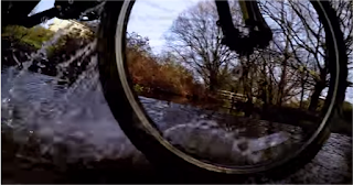
I also noticed that he filmed some shots in slow motion such as here where the bike is riding through the puddle. I think that shots of the scenery like this add more context to the video in order to set the scene, also acting as establishing shots. I would like to use slow motion editing in our video as I think it adds quite a mysterious element which would work well with our choice of song.
I noticed that this student actually filmed the entire video on a Gopro camera which meant that he was able to film himself and his surroundings without the need of a camera man. The long shot (show left) of usually himself and the background setting is a repeated element of the video however with a change of location each time. He also spins around with it so that the audience are able to see the full environment which I feel is very intriguing as a viewer myself. A negative of this video however I would say is the end shot which is text on an image of the artist saying 'Keep on spinning'- I do not think this looks very professional in comparison to the rest of his music video.
Overall, I would say that this music video is very successful- I think that the choice of song is excellent and the visuals are synchronous and run very smoothly with the track- especially in the section where he claps every time the song does and the scenery changes. Although he doesn't lip sync in any parts of the video, I do still think that it looks very successful and don't think that it is really needed as it is mainly 'visual vibes'. The variety of camera shots could be even wider as he often repeats a lot of them but this fits the structure of the music video and song. In our music video we are also going to use a lot of establishing and action shots of our artist's summer adventures however still include some lip syncing because I feel it is essential for our song.
Macklemore- Can't Hold Us
A particularly successful camera angle was the high angle point of view shot of the artist opening up the bag to find what was inside. I think that this gives the viewer an insight into what has been carried around London all day in a police chase- it turns out to be rather comical as the officer clearly thought that it would be something of importance but it was only a chicken. A variety of shots like this keeps the audience interested.
I noticed that they used lots of editing techniques as well. An example of this is when the video would momentarily pause and zoom out (however still with the music playing) and the ordinary visuals would convert into a posterized comic book effect. The costumes & story line are both very stereotypical of a comic book and silent movie which is why I think that the editing filter and thought bubbles work so well.
They used split screen in some parts of the music video such as in the police station scene where they're posing for their mugshots. I also think that this editing technique is very well done as there are two different things happening at the same time which keeps the viewer very busy and therefore intrigued. The black and white filter is used in this scene, possibly to differentiate different locations.
I think the continuity is excellent and runs so well and smoothly with the song. The continuity is particularly good when they spell out 'INDEPENDENT' and the letters appear on the screen exactly when they are said. The lip syncing is also brilliant which required lots of skill due to it having rapping in the verses which they managed to pull off very well. In terms of mise en scene, the costumes were very fitting and added some mischief to the video which enhanced the humour. Multiple locations are shown, mainly around landmarks in London which are very recognisable to the audience and keeps them entertained. I want to take some inspiration from this music video by also using lots of locations (such as possibly going to Brighton and London) as I think that a video looks more successful when there are a range of settings so that it doesn't appear boring. I also want to use some of their editing techniques such as a split screen and I feel that slow motion will look good too seeing as our song 'Without You' by Lana Del Rey is significantly slower.
R Kelly- Ingition (Remix)
Firstly, there are many shots that are not very entertaining and do not fit in well with the video at all. This long establishing shot of the high street is shown for around 15 seconds before the music even begins which makes it appear quite irrelevant as there is just silence for a long period of time without much purpose. I feel that if there was a real narrative at the start of the video like there was at the beginning of the student's Macklemore 'Can't Hold Us' video then it would seem more appropriate.
This next medium tracking shot of the artist walking towards the camera is shown whilst the singing in the song has begun. I think that this shot in particular looks very out of place as he isn't lip syncing which I feel would be essential during this part of the song. The whole video doesn't have any lip-syncing therefore we'd like to make sure our video has some in order for it to look as professional as it can.
I also feel that lighting was an issue in the music video. There were often cutaways of a girl applying make-up (close up shot shown to the left) and there was a lot of low key lighting in comparison to the ambient lighting used in the other parts of the video. This created too much of a contrast and didn't therefore flow very well altogether. When creating our music video, I want to ensure that all scenes are well lit for good continuity.
Despite this, a positive of the music video was the ending scene where it showed the couple walking off into the distance. I feel that the setting it was filmed in looked good and there was then a pan up to the sky for the video to then end- this was an effective use of camera work.
Overall, I don't believe that the students used a range of enough editing techniques- I noticed quite a few dissolves and cuts however the cuts were not synchronous to the music even when there were a lot of opportunities due to the beat of the song. I think that mainly due to the lack of lip syncing and the fact that the narrative was quite hard to grab the concept of that the video seemed unprofessional. This may also be due to their costumes too as although this may be representative of their target audience/teenagers, it didn't seem to really match the genre of the song. I think that if they had changed the song used to a slower romantic song then it would look much better as the visuals did not match at all and the pace of the cuts were too slow.
Beastie Boys- Triple Trouble
Whilst watching this video, I noticed that there was quite a lot of inspiration from music video director Spike Jonze. This scene (left) shows a street performer and public appearances are often seen in Jonze's video- Fatboy Slim's Praise You video is an example of a public flash mob. I think that cutaways like this in the video appear quite successful as they can help set the scene and also add the the randomness and wacky theme of the video overall.

I noticed that they also used a range of editing techniques. They used lots of colour filters where they would highlight certain elements such as pieces of clothing or their faces (normally a vivid luminous colour) and left the rest of the visuals black and white- this can make certain areas stand out more than others to, most importantly, grab the audience's attention.
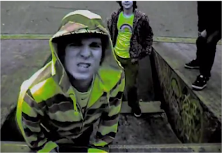
I feel that the split screens (where the screen was divided into four) were particularly successful and appropriate for this genre of video, mainly as it is performance based and the viewer is able to see four different things happening at the same time, which I think in an entertaining element. Their editing was also successful due to the fact that it was often synchronous in places to match the fast pace beat of the song. They used a range of different camera shots/angles. The majority, I noticed, were low angle, and often quite zoomed in to the artist's face which made them seem larger and more powerful as they are the most important thing in the video. The mise en scene was also successful because they are all wearing casual outfits and clothes to suit the genre of the song such as hoodies and caps. I feel that costume makes a huge difference in terms of how professional a video appears such as if you were to compare the clothing in this video to the previous R Kelly video where what they were wearing seemed out of place. Also the setting that this video was located matched the genre because it was in front of a graffiti wall which is associated with anti social behaviour and being 'gangsta'. I thought that the lip syncing was excellent and took a lot of skill from the performers as it was at such a fast pace- overall I would rate these students video as very well put together.


No comments:
Post a Comment